I have always been a big Disney animation fan, and I expect I will be for some time. Yeah, I will often agree on the digs and flaws of Disney as a company, but its animated films hold a special place for me. Not all are hits, but they generally do a good job with crafting and telling their stories. I've seen
Tangled, and I enjoyed it. But this isn't about
Tangled, this goes back a ways to another feature,
The Little Mermaid, and how I managed to mix it with another animated property I love,
Princess Tutu.

Those who follow this blog may notice that a lot of my fanart tends to be from the anime series,
Princess Tutu, and part of the reason for this is I'm a co-moderator of a
fan group of the series over at DeviantArt. This means we often come up with activities for the group to participate in, including monthly contests. That, and I really like the series. Becky, my fellow moderator, and I had decided early in the year to close out the club's year with a contest where the theme was a crossover with the Disney animated films, so I've had most of the year to consider what I wanted to do. Early in the summer, I made a list of potential ideas for both the announcement image and as a possible entry, including the image to the side of Femio as Emperor Kuzco that was used as part of the announcement image. That list included a lot of ideas that I thought were clever or cute, and a few that were what I felt were "obvious," ones that I expected a number of others would do or consider. Prominent among them were the "Princess" films and fairy tale inspired films, such as
Cinderella,
Snow White, and, most apparent to me,
The Little Mermaid.
For a long time, I did not want to do an "obvious" film and characters, and
The Little Mermaid had a lot that increased the chances of it being used by a number of other entrants. The two leads are both redheads, after a prince, not really human, and can't explicitly state their respective loves. So, in my attempt to avoid doing TLM, I considered others on my list and a few new ones, such as flower-loving Freya as the Sprite from the "Firebird Suite" in
Fantasia 2000, a young Fakir as
Winnie the Pooh's Christopher Robin or as Mowgli with Mister Cat as Bageera, and Uzura and Edel as Pinnochio and the Blue Fairy respectively from
Pinnochio. But I couldn't shake my initial idea; thematically and visually, having Ahiru and Fakir as Ariel and Eric just worked, and I loved the "Kiss the Girl" scene. I eventually caved and started working on it.

I did a number of studies, and found a couple of images of the scene online for reference. Thankfully, I have the DVD of the film, so I used that a lot. Amusingly enough, I actually spent a few days fretting over adapting Ahiru's hair from the anime design, which shifts the bangs to the other side whenever she turns her head, which doesn't quite work with Disney animation. Then I realized I only needed to do
one angle, so I got over it and worked on getting it to look right.

The images were drawn with a green Colerase pencil, then refined with a graphite pencil, and traced on a cleaner, larger piece of paper to get the boat in a better size. I then inked it and scanned it into my computer for digital coloring. The figures and boat were done separately from Flounder and the other fish because I wanted to be able to easily scale and move the parts so they were placed right.

Then came the fun part, doing the background. This was my favorite part of the piece, and the one I enjoyed doing the most. I believe I learned a little while doing this, and it's one of the few times I've actually attempted a background for a stand-a-lone illustration.
Next came the figures and the boat. One thing I was glad to learn is this scene was one that had flat coloring on the figures, i.e. no shading to have to emulate. I had to make color adjustments because the source scene is actually rather dark and not all that colorful. I opted to include Fakir and Ahiru's colors for them (green and yellow) instead of the original's colors because I wanted it to be them. This was a bigger decision for Ahiru, and I did briefly have dress and bow Ariel's blues, but it was agreed upon on Twitter that the yellows and oranges worked much better and fit Ahiru's character. The fish were easy, and the adjustments I made was to lower the saturation in the later stages.
Lastly came the effects, and it was my least favorite part. The fireflies were easy to do, and I had no problem doing that. It was the sprays and water lines that were a pain. I got something I was all right with, and the image was done.


 Those who follow this blog may notice that a lot of my fanart tends to be from the anime series, Princess Tutu, and part of the reason for this is I'm a co-moderator of a fan group of the series over at DeviantArt. This means we often come up with activities for the group to participate in, including monthly contests. That, and I really like the series. Becky, my fellow moderator, and I had decided early in the year to close out the club's year with a contest where the theme was a crossover with the Disney animated films, so I've had most of the year to consider what I wanted to do. Early in the summer, I made a list of potential ideas for both the announcement image and as a possible entry, including the image to the side of Femio as Emperor Kuzco that was used as part of the announcement image. That list included a lot of ideas that I thought were clever or cute, and a few that were what I felt were "obvious," ones that I expected a number of others would do or consider. Prominent among them were the "Princess" films and fairy tale inspired films, such as Cinderella, Snow White, and, most apparent to me, The Little Mermaid.
 I did a number of studies, and found a couple of images of the scene online for reference. Thankfully, I have the DVD of the film, so I used that a lot. Amusingly enough, I actually spent a few days fretting over adapting Ahiru's hair from the anime design, which shifts the bangs to the other side whenever she turns her head, which doesn't quite work with Disney animation. Then I realized I only needed to do one angle, so I got over it and worked on getting it to look right.
 The images were drawn with a green Colerase pencil, then refined with a graphite pencil, and traced on a cleaner, larger piece of paper to get the boat in a better size. I then inked it and scanned it into my computer for digital coloring. The figures and boat were done separately from Flounder and the other fish because I wanted to be able to easily scale and move the parts so they were placed right.
 Then came the fun part, doing the background. This was my favorite part of the piece, and the one I enjoyed doing the most. I believe I learned a little while doing this, and it's one of the few times I've actually attempted a background for a stand-a-lone illustration.

 This was my first page of sketches to get a feel for what to keep. Drawn from my memory of how the two looked. The next page is a mix of quick studies of Spider-man's costume. It's very iconic, and I think this is my first time ever drawing anything Spider-man related, so I needed reference. Damn that webbing on the costume. One thing I wish I could have had on my final costume is the webbing between his arms and body, but there weren't enough elements from the sailor senshi uniform to connect to.


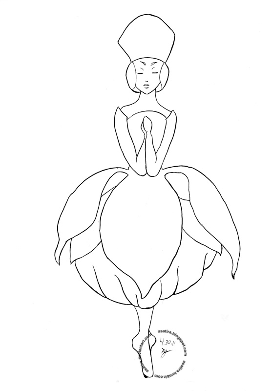
 The messy messy drawing. I am a messy artist, preferring to get things down and then refine, especially if it's going to on to being inked. Because I usually go to a lightbox and a clean piece of paper, the drawing can be this messy so long as they aren't too dark. Then I go over with a softer lead to make the final lines stand out.
 Final inks. Done with Copic SP Multiliners. I like them, but I need to work on using them and probably play around with the brushpen because the biggest drawback of them is the lack of line variety you get with the multiliners. I like getting some variety with smoothness. I got that here, but had to do it with multiple strokes and my hand isn't all that steady. Need to ink more.


