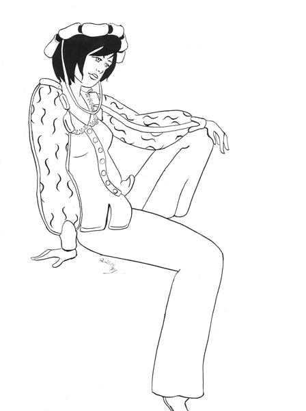
Showing posts with label inking. Show all posts

Saturday, October 22, 2016

Inktober 2016: Days 1-21

It's October, which means it's also time for Inktober again. I decided I was going to try for it, and I would use the 31 Witches prompt list from Tumblr user Ochibrochi. While I am trying to focus on use of ink, with a focus on texture and line techniques, I am still continuing my daily marker challenge. Below are the first three weeks of drawings, so days 81-101 of my marker challenge.

I began the month with a seasonal witch, in this case autumn. I used brown multiliners for most of the inking, except the shadowy familiar.
Seasonal witch

The rest of the month largely draws upon the black and grey pens and uses the four kinds of greys offered by Copic makers (cool, warm, neutral, and toner), although I do occasionally use colored ink pens such as brown or blue. Captions are provided for each image, since I'm responding to the prompt list.
Urban witch


Vagabond/merchant witch

Garden witch
 I rather like my approach to the socialite witch, such as the flying paparazzi camera eyeballs. I do want to redraw it because I wanted something more elegant and fashionable for the witch.
Socialite witch
 The oracle witch below is one of my attempts to use the whole card and a lot more use of the markers to get across effects.
Oracle witch

Seamstress/tailor witch
I am pleased with the results and approach for the blood witch prompt. The main idea behind my approach was that blood witches and magic are usually seen as evil and dangerous. But blood magic is at the core using blood as the source of magic, whether the magic user's or someone else's. I figured, who said it had to be evil magic? Wouldn't a blood mage be a great healer? I am also pleased with my attempt to use a little cross-hatching in transitioning from the solid black to the white of the blood magic.
Blood witch

Lolita witch

Wicked witch
 The next two were a bit weak in my opinion in approach and execution. There is barely any marker use in the first two, and the linework is pretty simple. I want to redo the solar witch to get across the dancer and worship aspect that I had in mind but couldn't execute at the time.
Solar witch

Candy witch

Pixie sprite
 My space witch is another image I really enjoyed the result of. I liked the idea a witch with a space-jet broom and doing technical work on space stations.
Space witch

Royal witch

Beastmaster

Necromancer

Music witch

Technology witch

I had quite a bit of fun approaching the mermaid witch. I drew a little bit on Ursula's lair from Disney's The Little Mermaid and the viewing bubble. I used the Copic blender to help highlight some of the scales on the tail.
Mermaid witch

Potion witch
There's still another ten days left for the month. I want to try using more line weights to get more dynamic feels to the final images. I do tend to use only a couple of the pens, so they can feel pretty similar and dead. Let's work on that.

Sunday, March 20, 2016

Fan/Gift Art Walkthrough: Secret Santas

I love creating fan art, and I don't do it enough. I also enjoy creating art for others, which is why I've frequently taken part in fandom secret-santa exchanges, mostly in Portal and Slayers fandoms. This time around, I approached them a little differently.

Normally, when I do a piece of art, I draw it all on one sheet of paper, pretty much going straight through on it. The downsides of that method is loosing the original sketches and being harder to correct if there are errors. This time I opted to use my lightbox and do the final pieces on fresh pages.

Both drawing were drawn on the back of some manga paper that I had, about 10"x14", to avoid the guidelines. As you can see below, I drew the rough lines for each picture in red and blue erasable color pencils.


I then inked each piece on a clean piece. For the Slayers image, I stopped at inking with Copic multiliners. For the overall piece, I drew inspiration at the recipient's request for "Netflix and chill," a more literal interpretation, and Candyland. My idea is that the gang found a visual archive while searching for some treasure and artifacts and have been bingeing on some history vids for the last day or so, only to be surprised by some twist that everyone, except for Gourry, was not expecting. The Candyland ref comes in the form of the figure in the "video." Guess who it is.


For the Portal image, I pushed on to coloring it in Photoshop. I really wanted to make it clear that poor GLaDoS was covered in Christmas lights, which I couldn't pull off in black and white. It really gets across the ridiculousness of the situation.

Friday, October 5, 2012

Shyir and Amala Rev

I'm a pretty moderate fangirl, and I don't tend to do all that much artwork for the series I really like. I want to do more, but you can probably tell which series have hit me the most by the amount of fanart I do for them. Green Lantern: the Animates Series is one of those rare series. It took a while for me to let myself get into it, but even from the first couple of episodes it was inevitable I would fall for it. It takes a lot for you to fondly remember a character that was (spoilers, but this was in the movie/first episode!) set up pretty much to die. But the fandom and I really liked the character of Shyir Rev and his family. He's the first Green Lantern of the Forgotten Zone that we get to know, and his actions have an effect on Hal, Kilowog, and Razer. A great, warm character with not that much fanart of him.

Below are my attempts to rectify that, even if it's only a little. I started with some studies from the paused video (at the time, I only had my digital copy, so no screencaps that way). Shyir and his species are tricky to draw.


 I then moved on to the picture proper. I'd had the idea, one of a couple, really, for months, so not much time was spent on planning. And the image is pretty straightforward. Amala is tending her father's minor cuts and bruises with loving, youthful exuberance. I started with blue pencil roughs, first of Shyir, then I put in Amala.


 The final picture was inked with a Maru pen nib and FW Artists Acrylic ink. The Maru was used because I started with the intent of finer lines, but that didn't last long. This was my first time really using FW acrylic ink, and it worked very well overall. The only draw back is how often I had to clean my nib and brush because the ink would dry a little on both and build up, preventing the nib from flowing well and the brush got a little stiff. Nothing pen cleaner or water didn't fix up.

I scanned it in, evened out the black, and below is the final picture.

Saturday, May 28, 2011

Air Kiss Walkthrouh

For May's contest over at Club-Tutu, the theme was underwater, and was open to a variety of depictions, so long as the characters were actually in the water. After trying a number of ideas, including a pairing with Mytho and Rue, Ahiru and Rue together, I eventually settled on doing either Fakir and Ahiru fluff or a cute Ahiru solo. Below are the pen sketches I did one evening, and put up to get feedback. The Fakiru piece was the one chosen.


Tuesday, April 26, 2011

April Drawing Days 24-25

A walkthrough of a piece I did based on my friend Becky's steampunk characters, Conn and Odette Lohengrin.

I started with a pencil drawing using a .7mm mechanical lead.

Followed by inking with a Maru pen-nib, so the lines are little more uniform than if I'd used a G-pen. Deleter Black 5 ink.

Final cleaned up inks.

Thursday, December 23, 2010

2010 Secret Santa

Once again this year, I am taking part in a number of secret santa exchanges. Three, actually. Two of them are from art boards I frequent, ConceptArt.org and CGHub, and both are physical gifts to be mailed. I dragged on this one, but ultimately am largely pleased with what I came up with. Because I was doing two, I eventually settled on the idea of doing something paired but could stand alone. I have wanted to play with the theme of chess pieces for a while, black/red versus white, and each would have a thematic look. In this case, while I don't think I got across the "queen" aspect, I did manage to stick with the contrast/opposites idea.


One thing I am pleased with is how these are pictures I managed to ink with a G-pen nib and my WN #2 for the solid blacks. The originals, unfortunately, have some smudges, but nothing that distracts from the overall pieces.

I'll post the last secret santa image(s) when I get it done and sent to the recipient.

Friday, June 18, 2010

Inking attempts: G-pen and Maru

You may recall my last post was where I showed off the initial results of my inking with a Saji pen nib. This post is also about trying out pen nibs, and will probably be the last one for a while about the initial results.


G-pen
The first set of images are from a G-pen. This particular nib has been mentioned in a few books on inking from Japan, and I can kinda see why. It's a nice nib, giving a lot of variety and gave me pretty good control overall. The lines seem very nice to my eye.
What I Learned from My Attempt
I'm not sure if it was because I knew what to expect from the previous attempt or if the nib was just better, but the ink flowed more smoothly. There wasn't as much catching on the paper that I had with the Saji. I knew from this test that in the foreseeable future, I'll be using the G-pen nib for inking.


Maru
This is the last of the trial set I had ordered. Unlike the previous two, the Maru pen nib is meant for fine lines, so if you're someone who wants thin lines, go with this one. It does have some flexibility, so there is variety available, but thin lines are its strength.
This is the messier of the two attempts posted tonight. The cape is thicker and messier because I attempted to do some inking with a brush, which clearly wasn't that great. The smudges came from my hand getting into the ink, Deleter Black 2, which hadn't dried yet when my hand went over it.
What I Learned from My Attempt
This is another nib that caught on the paper, or felt like it. I got the overall thin lines I wanted, and slightly thicker ones with only a little effort. The Maru is probably not the best option if you want to fill blacks. It is not good for places where you want solid black, like the pupils and the eyelashes. Curves were a little tricky, but that may be due to my inexperience.


For now, most of my inking attempts will be made with the G-pen, but I can imagine ways of using the Maru. The Saji will probably be used once I get better with inking in general and can better manipulate it. Using all three in an image is not out of the question.


So that's it right now on my inking. Future posts will be back to progress and finished images.

Thursday, June 10, 2010

Inking attempts: Saiji pen nib

Tools. I like tools, especially art tools. I'm like a lot of people who is interested in what tools artists use and how they use them, trying to figure out the limits, advantages and disadvantages of each one. Only challenge is learning how to actually use the tools. Something I want to work on with a lot of materials. This time, inking.

To keep this short(er), I've been interested in inking my artwork for both illustrations and especially for my sequential work, and I've been wanting to move past using Pigma microns (including my current go to pens, Copic Multiliners) to pen and brush inking for a while for at least one reason: line variety. You can get some variety with microns, but it takes some work. Nib pens and brushes can get a lot of variety in one tool. Each varies, pros and cons and all that. And they take more practice to get really good. I don't plan to drop microns completely, but I want to build up my resources.


Here is my first attempt at inking an actual image with a Deleter brand Saji pen nib, using Deleter Black 3. You probably recognize the image as my Power Girl image from a while back, and I liked it enough I thought I'd use copies of it for practicing on. Helps to get over the whole fear of damaging a nice piece with bad inking when you're working on a copy.

I don't plan to post every attempt at inking, but the first attempt at a tool will most likely go up to act as gauge of improvement.

What I Learned From My Attempt:
It's been mentioned in a couple of books and articles about inking, but you don't realize how much it is so until you try it: nib pens are scratchy and tend to catch on the paper. That takes some getting used to after working with materials that don't catch as much. Sensitivity is a much larger issue than with microns. There are a few places where I let up the wrong way and kind of flicked the pen, ruining an otherwise smooth line. There are a few splatters and places where I didn't have enough ink for the width I attempted. Placement is a biggie too. Lastly, it's best to occasionally clean the tip because of said scratchiness or digging into paper; the thick line on PG's upper left arm was caused by some paper fiber getting caught on the tip.

I can't really say this is better than my original inked piece, but I'm glad to be attempting it because there's at least one place I'm pleased with. That's this:


Yep, that line of her upper leg, and to a degree, the bottom line for bottom of her thigh. It has the line go from narrow to thick and narrows again. I like that.