Sunday, September 18, 2016

Marker Challenge: Days 67 and 68

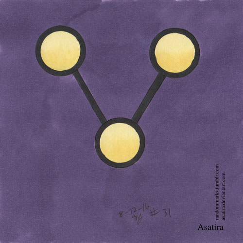
Decided to round out the Sailor Senshi group by doing these last two pieces, one for Sailor Chibi Moon and one for Sailor Pluto and Sailor Saturn. These were the first two pieces using a new sketchpad, a Strathmore Artist Tile format using the bristol paper. I'm still getting used to this paper type. It does moderately well with blending and doesn't have much bleed. I'll see how well the paper does over the next dozen or so images.


One thing I like about the second image, the one of Sailors Pluto and Saturn's wands, was how I was able to salvage it. Namely, I messed up with the background at first. I wanted to go for a starry background from the start, and I tried for a streaked background with a number of colors, but I did not use them in a way that would blend seamlessly. Those first colors had too much difference in values. I then grabbed a dark purple marker and went over the first background, and that helped to blend the background. I think the final version is pretty decent, and the white gel pen stars helped sell the piece.

Saturday, September 17, 2016

Marker Challenge: Days 60-66

With days 60-66, I finish the sketchpad that I was doing the drawings in. While the Strathmore sketch artist tiles have 70 sheets, there are 66 because I used one sheet as a reference for the markers and about three sheets were accidentally marked from bleed-through or too juicy a marker. I think the paper worked well enough, but not really intended for inked pieces. I noticed this with some of these last pictures when I switched to a much finer pen. Something to keep in mind for the future.

This latest set of images are a set of fanart referencing the tools of two magical girl series I love, Cardcaptor Sakura and Sailor Moon. The first two are Sakura's sealing wands, and the remainder are iterations of the Sailor Senshi's transformation tools.


I made an effort with all of these to make them dimensional, to shift away from the flat, graphic designs that I have been doing for the last month or so. There is an effort at perspective and shading for all of these.

I look forward to the next drawings and the new papers I'll be using. I look forward to more improvement.

Saturday, September 10, 2016

Marker Challenge: Days 42-59

Got a big collection to post today. I continued my logos and badges theme of the previous weeks, although it was broken up a little during my usual trip to Dragon Con.

Before the trip, I did a quick fanart of the webcomic Namesake and a series of Flash-related fanart pieces.


I also did a trio of fanart based on the miraculous of the heroes and villain of Miraculous: Tales of Ladybug and Chat Noir: Ladybug, Chat Noir, and Hawk Moth.


 Then it was time for the con! I track my drawing habits, even if it's just a quick doodle. Last year, because of the activities at the con, I broke my nearly year-long drawing streak. I didn't want that to happen this year, so I went in with the general plan of drawing from Star Trek and Star Wars emblems, which I did with the exception of the first night. That night I made an effort to draw one of the buildings I could see outside the hotel room. For all of the Dragon Con drawings I was limited to some colored pencils for the rough sketches, some circle guides, a few pens, and a handful of neutral grey Copic markers. But I got them all in.


 Post con and I was back to my full-color collection, plus a few additions from my run to an Atlanta-location of Blick.
 I like this attempt at Vixen's necklace because I attempted something dimensional. It is easy to fall into doing more simplistic images when doing emblems, so opting to go with the item for this and my Black Widow gave me a chance to try and get some dimensions into my pieces. I will try to do more dimensional work in the upcoming days' drawings, where it's appropriate.


 This last piece was a request from a friend of mine for the Legion of Everblight's emblem. I attempted to make it look like a stone inlay. I should do more materials studies so I can better emulate different textures.
It's hard to believe, but I'm almost at 60 pieces. I plan to keep going to at least 100 days of drawings, and I may continue past that. And I am learning more about how to use markers. I've learned how using line work can influence the look of a piece, and how it can look more painterly without, or softer with the use of non-black ink. I have also started adding refills to my collection because using the markers means they run out. That hurts the wallet a little, but I'm glad to have the refills since I can have nice, smoother applications of color with a refilled marker versus a dry one.

I hope you will keep following as I continue playing around with my markers.

Monday, August 22, 2016

Marker Challenge: Days 34-41

Still doing the superhero emblems.

After the above X-men and Deadpool images, I decided to switch over to doing lineless renderings. It tends to result in softer, more painterly images. I also had a few goofs, which you can see in two of the Captain Marvel/Shazam related images.


Sunday, August 14, 2016

Marker Challenge: Days 25-33

I'm still doing the fanart based on logos, badges, and emblems. I intended to do a set of pokeball-based images, but I decided to switch over to other emblems and badges for a while. I got the first of the three I intend to do finished, and I'll probably come back to do the other two at a later time.

The below image is collection of my top six fave poké balls from the series. They include the classic poké ball, followed by the great ball, ultra ball, repeat ball, quick ball, and timer ball.

Actually, before I did the poké balls, I drew a shout out to Dragon Ball and Dragon Ball Z, the Capsule Corp logo. This logo is actually one of the first images I wanted to draw for the current theme.

After the Capsule Corp badge and the poké balls, I went pretty much with super heroes and villains. The current set comes pretty much from DC Comics, but I will try to branch out to more companies and franchises in the future.


Friday, August 5, 2016

Marker Challenge: Days 21-23

Continuing with the logos and badges, and that means the other half of the original Kanto pokemon gym badges.


 That's probably going to be it for the pokemon badges. I'll need to refresh myself about the later games to see what the those gyms are themed after to decide if I want to try different themes or the same themes with a different approach.

There will be a little more pokemon to come in the next few days, however. See you then.

Tuesday, August 2, 2016

Marker Challenge: Days 17-20

On to the new second theme for this little challenge. In general, I have switched over to logos, badges, and icons because I wanted to have some fun with graphic but potentially fun images. This theme will have a mix of original and fan creations, with probably more fanart at the start.

The first set is the Kanto Region gym badges from Pokemon. I enjoyed the game and the badges are probably familiar to many people. I decided to do the badges with representatives of the corresponding elements behind or surrounding each one. These combinations would allow me to play with backgrounds and design and a few elements.


I probably enjoyed the Cascade and Thunder badges the most of the ones I've done so far. I wanted to play with doing water around a pile of sand to refer to the original water gym, and I think it turned out well for one of my few attempts at water. I am also pleased with how I was able to convey lightning for the Thunder badge. The only downside is that because of the design elements, the badge is smaller than the others. Oh, well.